Bridgeway
Rebrand
Recognition
Transform Awards, (Silver)
Context
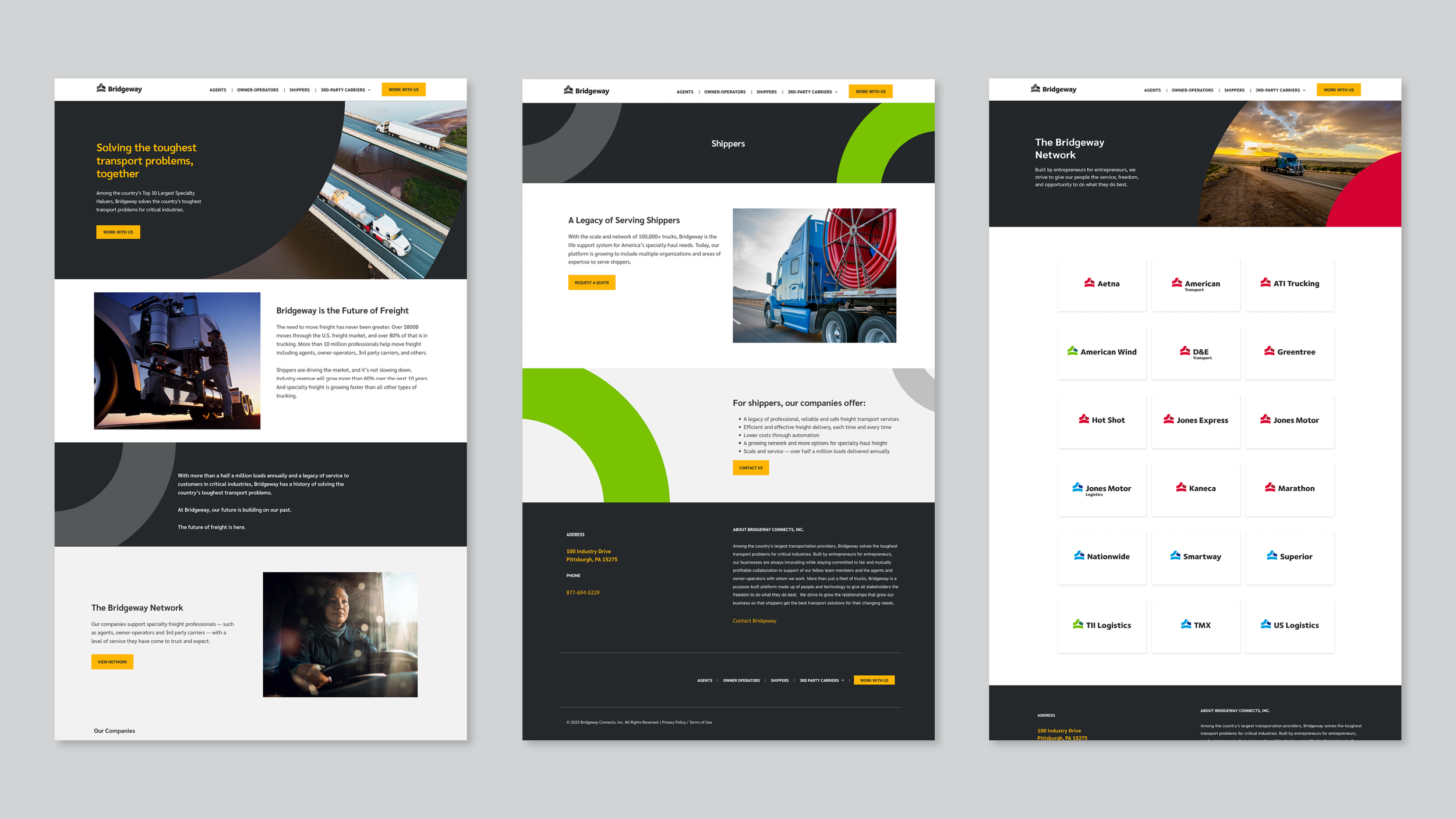
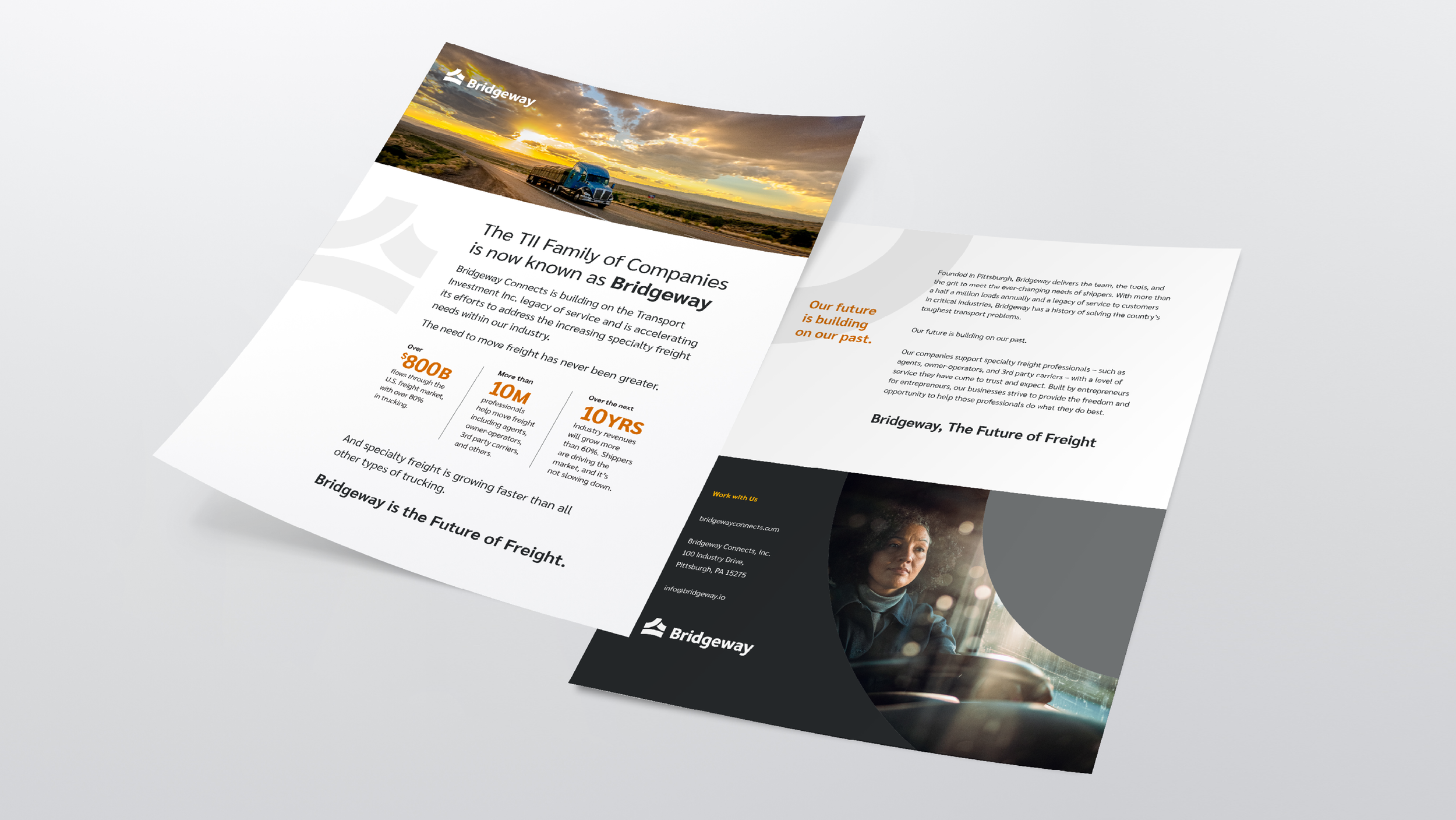
Bridgeway is one of the country’s largest speciality transportation and logistics providers. With 20+ subsidiaries and over 500,000 loads transported annually, Bridgeway helps solve the toughest transport problems for critical industries with specialty freight needs vital to the national economy.
Solution
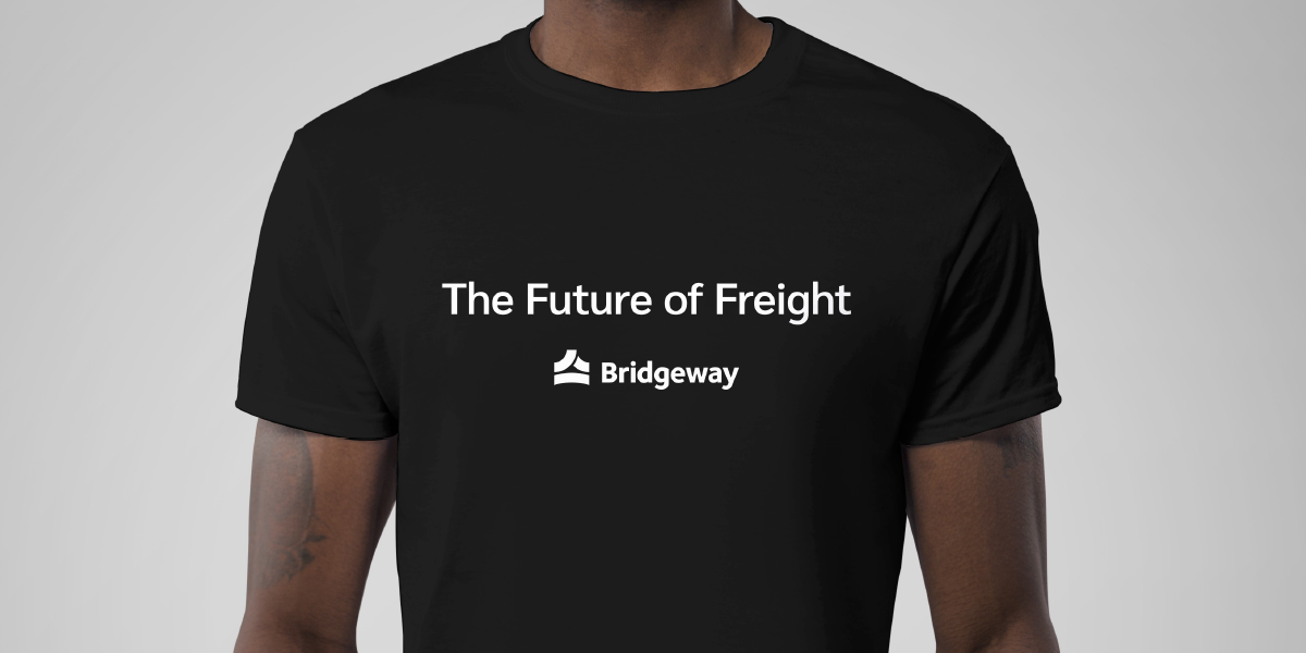
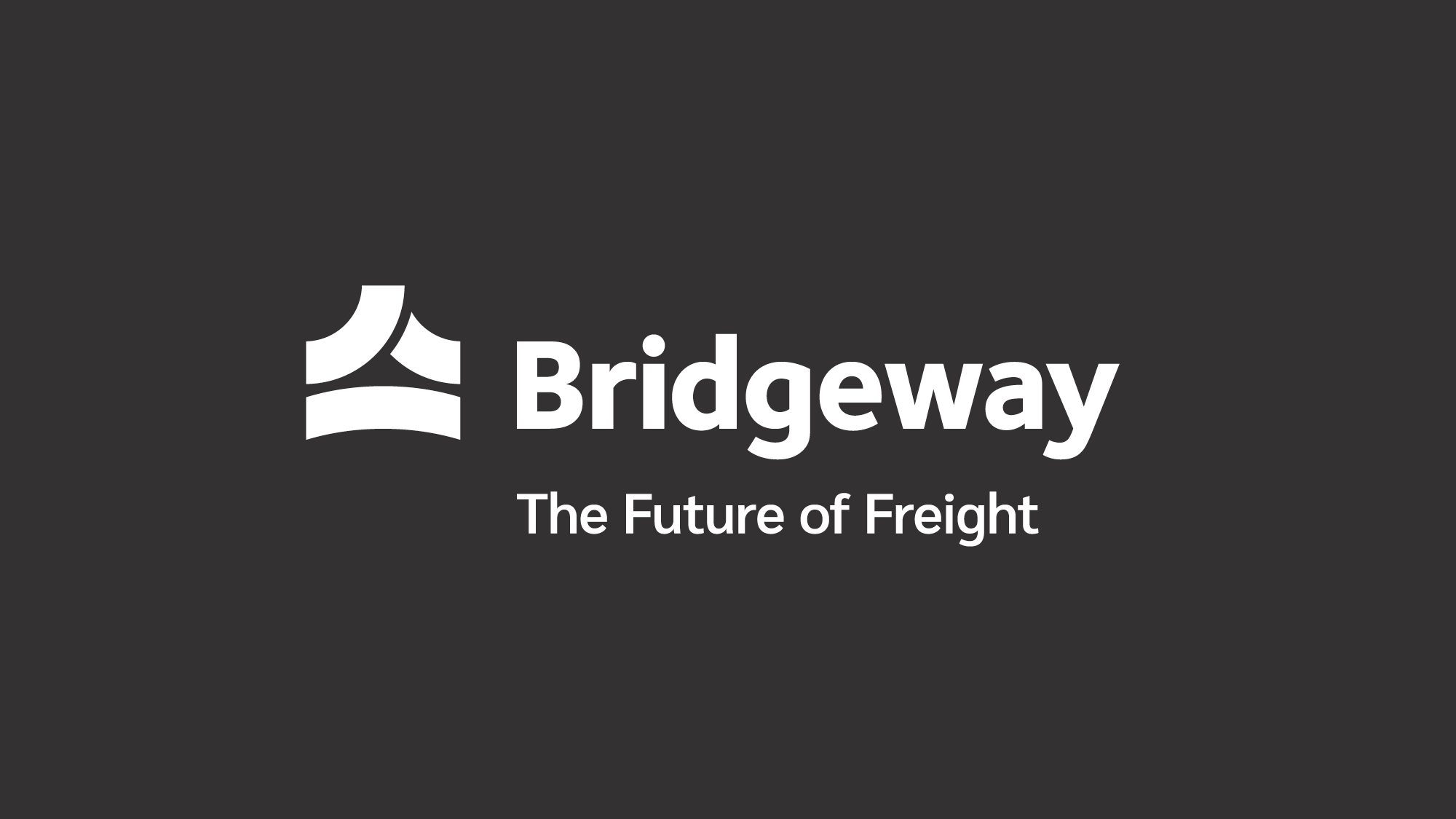
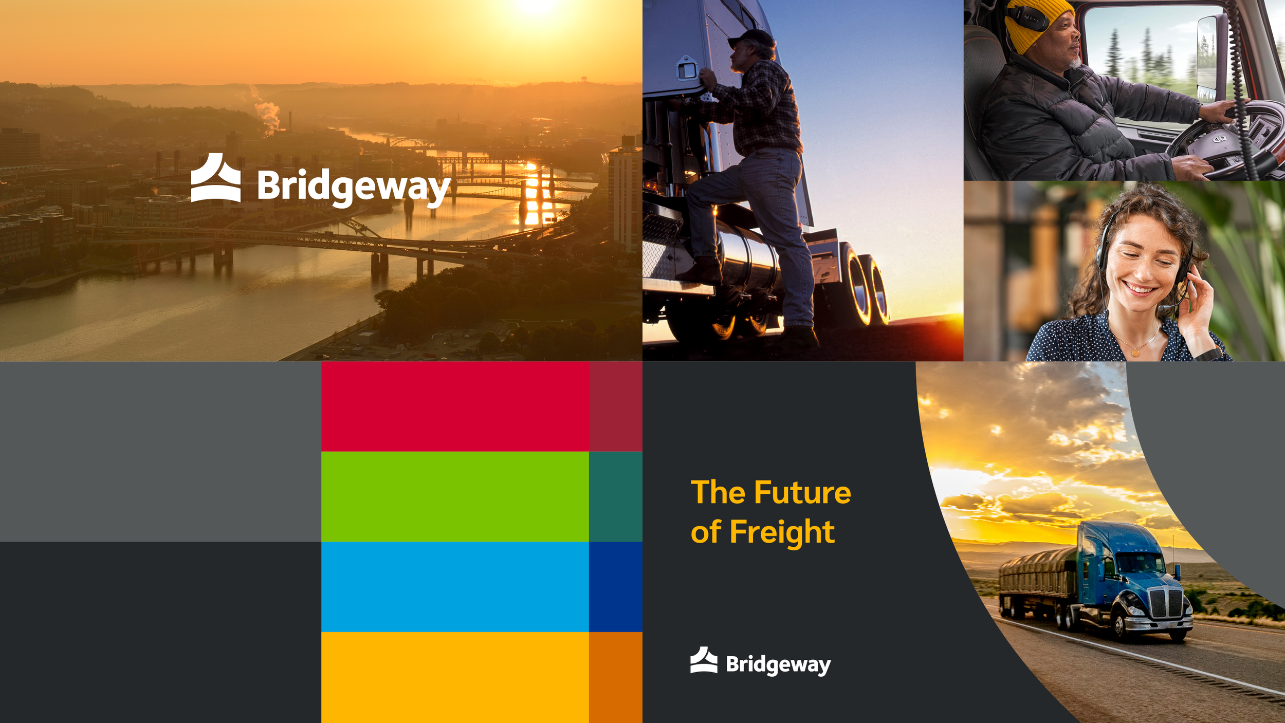
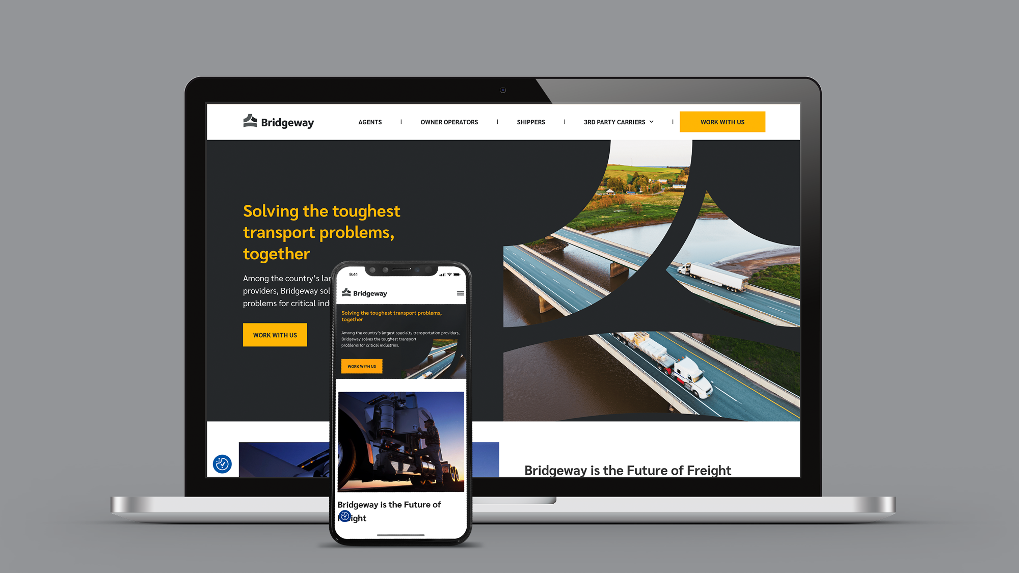
As the company continues to evolve into a more purpose-built platform of people, transportation assets and technology, it needed a new market-leading parent brand and cohesive story to clarify and exemplify the collective value of the network of companies. Bridgeway’s new tagline, “The Future of Freight”, emphasizes the people as the backbone and future of this industry.
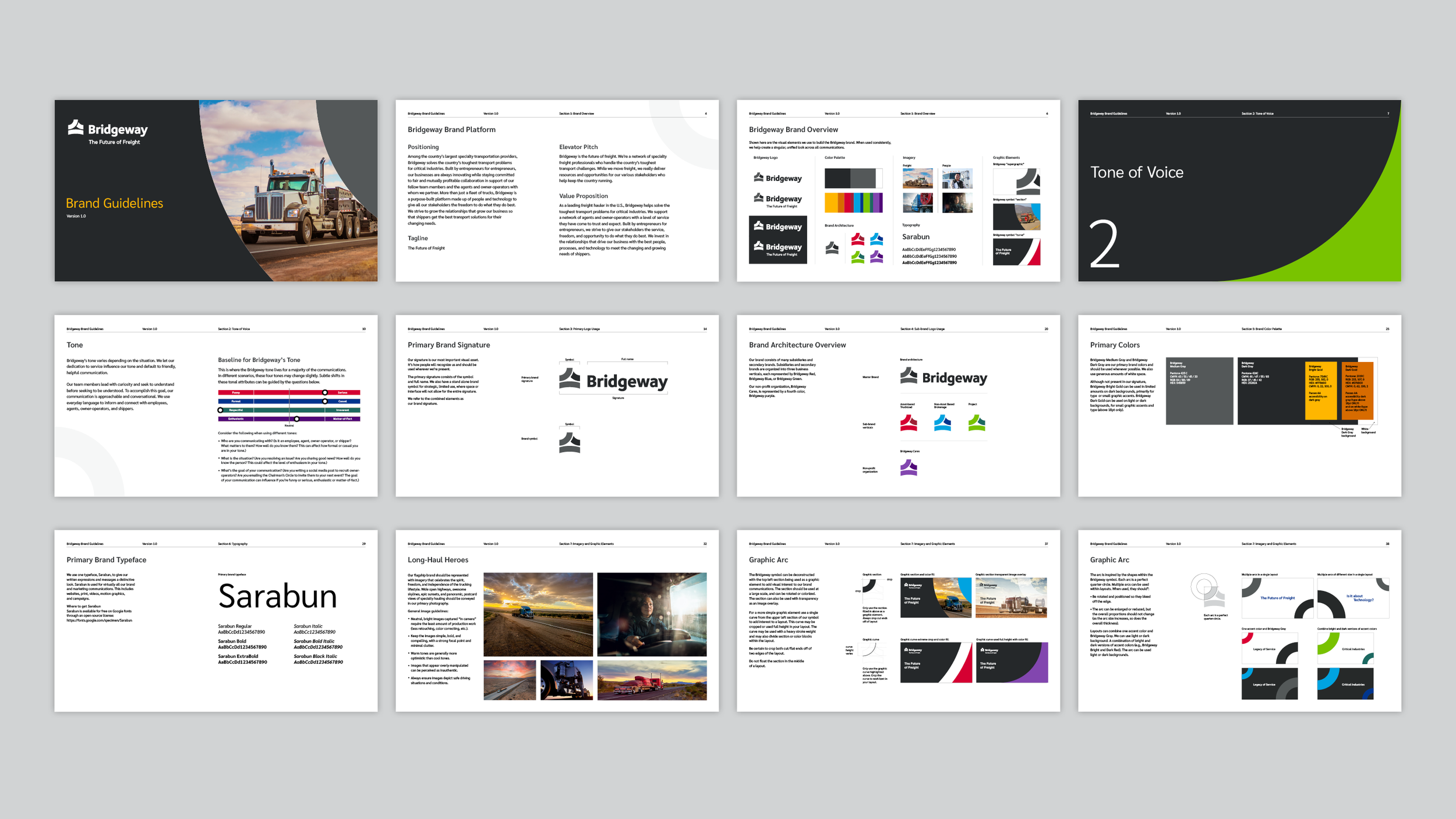
Visual Brand Expression
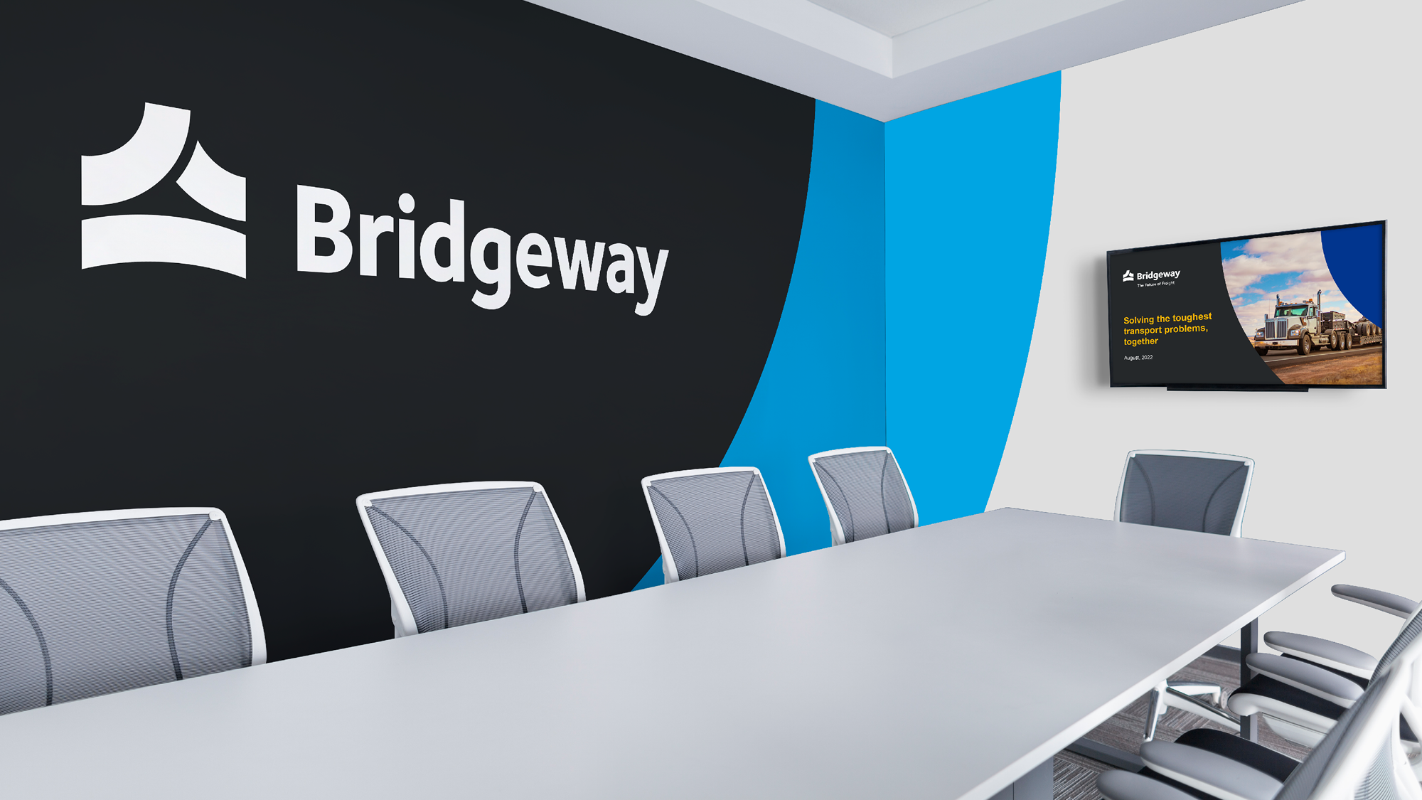
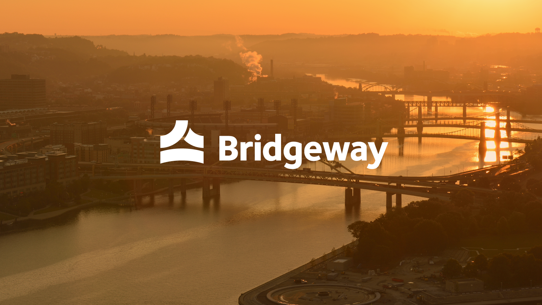
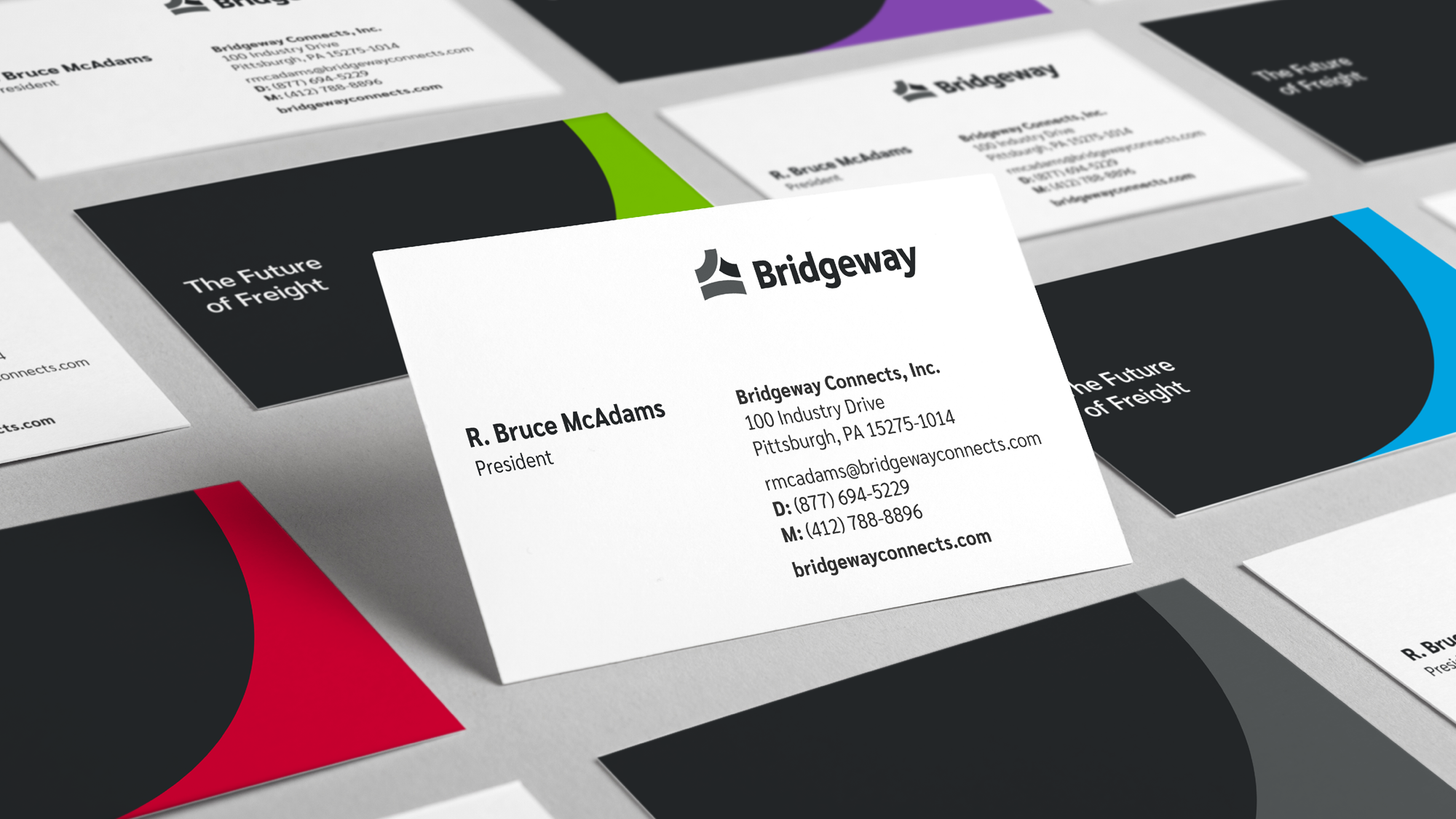
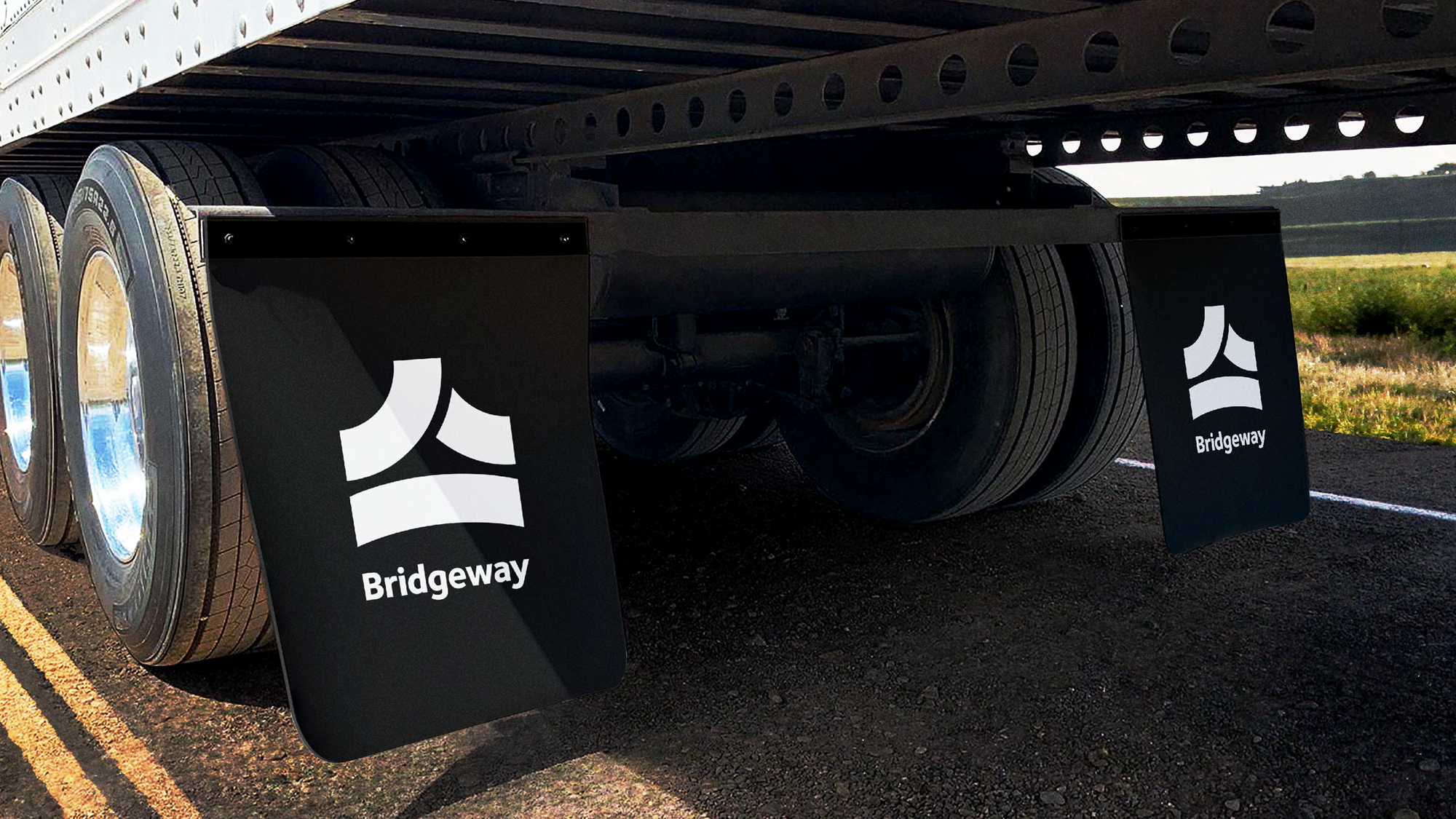
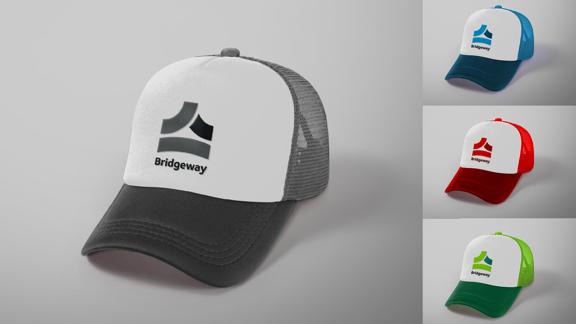
Based in Pittsburgh, the city of bridges where over 40 major bridges exist in the metro area, Bridgeway needed a logo that connected with both its history, the city's history, and also served as a bridge to its future. The three circular sections combine into a simple, balanced mark that evokes forward progression and movement. The convex shape of the lower arc suggests overcoming obstacles and resilience. A friendly modern sans-serif font with gentle curves complements the brand symbol and the idea of a smooth journey. Finally, the no-nonsense tagline treatment speaks to the authentic industry of freight transport. The symbol also lends itself to being used as a color-blocking and framing device for photos and textures.
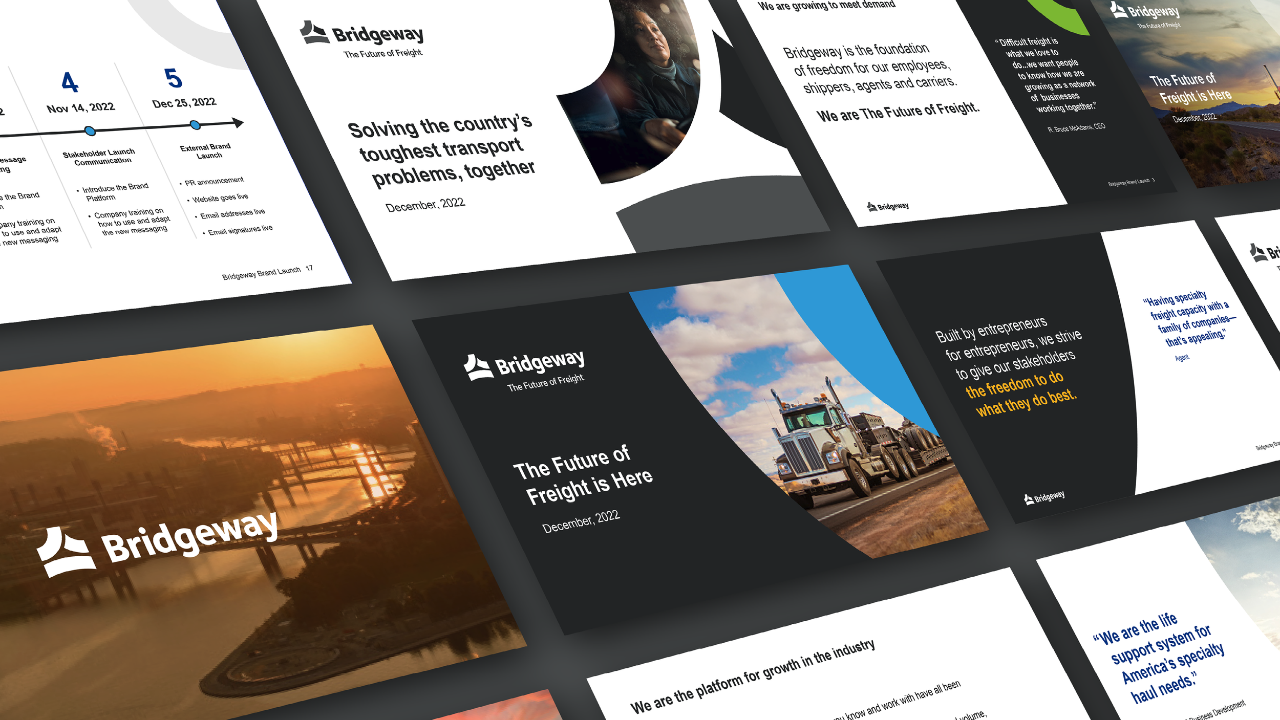
Brand Implementation
Here are and projects featuring the brand in real-world use cases.

Social media campaign, brand introduction.
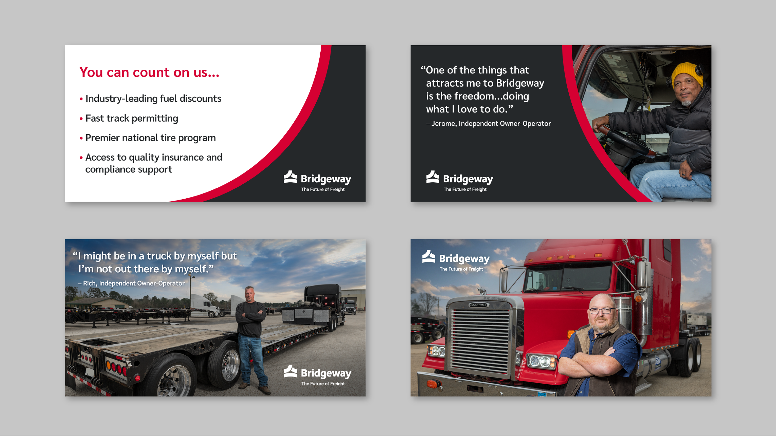
Social media campaign, targeting Independent Owner-Operators.